Showing posts with label junk journaling. Show all posts

Thursday, January 7, 2016

ancient city

Carolyn Dube is hosting a rediscover how to play challenge this year, yeah awesome!
I think it’s kind of a continuation of her permission to play class, if you haven’t taken this class yet I can highly recommend to do so (and pstt it’s even free)
Every month there will be a challenge which you may or may not follow, you can link up to 3 times a week and each month there will be an awesome price to win, like a 50 dollar gift certificate to Dickblick this month.
So on to this month’s challenge which is to use something that would have been thrown away.
I must say I need to interpret that as something that someone else would throw away, as I am a total hoarder and see a use in pretty much everything. (much to the dislike of the DH)
Here is the evidence to show for it, a bin full of “junk”


So I dived in and pulled out these, some teabags and a crown from a cake decoration (it’s a tradition here in Belgium on January 6th to eat a “three kings” cake which has a crown on top and a treasure hidden inside, whoever has the treasure is king for a day).


I started by glueing the crown on my page as a border


Applied a layer of gesso


Suddenly an ancient city appeared to me (probably due to the fact that we are currently searching for our next summer family holiday and I’m looking at Italy in particularly), as it is on both sides of the page it looks mirrored.

I used a blue gel stick and a babywipe to color the sky blue.


Added some script stamping and colored the holes in different colors of the rainbow.


Don’t know for sure whether it is complete (I know I didn’t use the teabags, these will go back in the box and appear somewhere else no doubt), but for now I call it done. And didn’t Carolyn say that it is not about finishing, but about the play.
I must say I’m still not in complete play mode as I overthink way too much each step, and worry about the outcome…
But heay I’ve got a whole year to join in the fun and find the inner kid in me again.

Monday, March 16, 2015

newspaper junk journal

The inner pages of this truly “junk” journal are made out of newspaper and the cover was a cereal box in a previous life.

I started by gluing 3 newspaper pages together to give them some sturdiness and let them dry on a washing line


Whipped up a batch of homemade gesso with following ingredients: white paint, glue and gypsum powder.Gessoed all the pages and cover, couldn’t hang this on the line because the pins would make marks (although this could be interesting too), so laid a couple of large plastic bags on the floor and laid them there until dry.

This gesso is really gritty, next time I will substitute the gypsum powder with some baby powder and see how that turns out.
I made 5 signatures of each 2 pages, I cut them to 25x18cm to fit in the cover.

I decorated the cover as followed: painted it in metallic colors and stamped some text randomly 

glued some tissuepaper on top which I stamped all over with butterflies.

I reinforced the border with some ordinary purple masking tape which on the outside was beautified with a flower stamp.


On the inside I collaged some vintage styled scraps, gave it a whitewash and stamped this heart shaped text. 

I wanted to add some beads to the binding and tried to make my own for the first time, watched some tutorials and got to work. I love how you can turn paper (scraps of paper in fact) in sturdy, wonderfully patterned beads. It was time consuming though but worth it in the end


I used a 3 hole pamphlet stitch to bind the 5 signatures, adding the beads on the outside. 


Really like the end result.  The only thing I find a little annoying is the space between the signatures on the inside binding, between 2 signatures you can see the cover. Maybe I should make the spacing between the signatures smaller? But I measure the spine and evenly divide that, otherwise it would look odd on the outside, no?  Is this something you always have with this binding? Maybe it disappears when you add to your pages?

Tuesday, February 3, 2015

Doomsday clock

According to Wikipedia the Doomsday Clock is a symbolic clock face, representing a countdown to possible global catastrophe (e.g. nuclear war or climate change). It has been maintained since 1947 by the members of the Science and Security Board of the Bulletin of the Atomic Scientists, including 18 Nobel Laureates. The closer they set the Clock to midnight, the closer the scientists believe the world is to global disaster.
 The most recent officially announced setting—three minutes to midnight (11:57 pm)—was made on January 22, 2015 due to climate change, the modernization of nuclear weapons in the United States and Russia, and the problem of nuclear waste.

This article caught my attention and I needed to include it in my ARTicles book.
I started by gluing down all kinds of waste on my page: a tear off pallette, a used babywipe, the packaging of a tea bag, a ribbon and some left overs from previous projects.


I then divided the page in 2 parts to represent the northern and southern hemisphere, the southern is drying up and becoming a desert and the northern is facing floods.
So I used an ochre color for sand and wanted to crackle it by using glue in between but this didn’t seem to work, maybe wrong kind of glue, instead I used my heat gun to create some bubbles to represent dried out sand. The upper part is painted with an aquamarin blue, initially I intended to add glossy accents to make it more watery, but I already liked it the way it was, it looks like an underwater world to me.


I randomly stencilled different types of fonts of the number 3 on the page. I cut out 2 globes from a printable found on www.farfarhill.blogspot.be, ran it throug my embossing machine with a clock embossing folder and added walnut DI to the raised areas. Printed out some huge environmental distasters, colored them with linnen and walnut DI to make them look like old newspapers and cut them with a decorative scissor. 


I am surprised with how easy I am inspired by the news and how my ARTicles book is progressing, what would be even greater is if you would join in the fun; just hop over here  and become a member of my group.


Wednesday, January 7, 2015

birthday party

Saturday we had our first birthday party of the year and at the same time still needed to exchange our new year gifts.
I created my second page in my ARTicles book about this occasion.
I was over the moon with my present: 36 Derwent inktense pencils and a mixed media paperblock.
Off course I wanted to give the pencils immediately a try and created this background


I choose this color scheme because the person who’s birthday it was wore a boa and sunglasses in these colors.

I added some pieces of giftpaper (I always keep the gift papers, if my son hasn't ripped them completely)


And made this masque, because the boa in some way reminded me of a masquerade ball.


I also carved this stamp 


Used my wall of words stencil with the very appropriate text  Time to drink champagne and  dance on the table. I just needed to add a bottle of champagne and some journaling.


Want to know more about the ARTicles project, hop on over here to find out everything you need to know.


Wednesday, November 26, 2014

bottle

The deadline for the junk journaling challenge with the theme ‘bottle’ is november 28, so I needed to get my second page done quickly.
I gave myself a time limit of an hour to complete this page.
This was freeing, because there was not much time to think and ponder, just action.
In my head there was an image of an exploding champagne bottle, that was the starting point and this is what it finally became 


I started with a piece of cardboard from a popcorn box (I found that suitable with the popping aka exploding J)
I painted different colors of acrylic paint with a cork from a wine bottle. (the only issue was that I needed to dry this and this was time consuming)
Don't you just love all that texture?


I then outlined some circles in black and added dots. Used a bottle cap to create some circles in hot pink and used my finger to add some fluo yellow dots. Glued some magazine pictures down from wine bottles and that was the background done.


As focal image I cut out a cava bottle from some junk mail, wrote my quote in it: don’t bottle things up, they will only explode.
The butterfly in the corner is cut out of a wine label and decorated with acrylic paint.

The butterfly also fits in very well with the escapada from the label of the cava.


In my last minutes of the hour I altered the images of the bottle and butterfly a bit.


Monday, November 10, 2014

message in a bottle (junk journal page #22)

Clare has set us a challenge for this month. We need to include the theme bottle in our recycling project.
This is what I came up with


For the background I glued down pieces of dried up acrylic paint (remember the jar?)
Sprayed with some Dylusions spray inks and stamped some circles.
I loved this summers workshop from Clare, the Me time Messages, so much I proceeded. I wrote a little note to myself on a piece of baking paper which has an aged look because I used it to tea dye some papers.On the back I stamped message in a bottle and added some washi tape butterflies, my all time favorite creatures.


I rolled this up and inserted it in my bottle, this is the plastic packaging from my owl I recently bought. 
My message in a bottle is floating around in the sea somewhere so I added some sea life to the page.

Junk used:
cereal box
dried up acrylic paint
baking paper
plastic packaging

Monday, October 27, 2014

I have never...

October’s challenge over on Journal workshops is to create something with a technique or supply you have never used before.
Ok, I can name a few supplies I have never used because I simply don’t have them (yet), like pan pastels, inktense pencils (all on my birthdaywishlist by the way, which is next week, so fingers crossed J)
But I also never have done a proper collage, meaning I often glue some pieces of scrap down as a basis but I have never created an image out of several magazine cutouts before. So this was my challenge for this month.
I did some research, because I did not have a clue on how or where to begin. I’m really thankful that there exists something like YouTube, I found the videos from Tracy 'Teesha' Moore very helpful.
After watching them I felt a bit more confident to get started.

So I grabbed a piece of aquarelpaper and slapped some yellow and ochre watercolorpaint on it.


Added a collaged border


And made this image out of: picture of a child’s windmill, a body, a scarf, a head and a perfume bottlecap as hat.


Next came the altering of the image with some doodles (also something I hardly ever do and do not feel comfortable about, need to practice some more on this, I recently bought a book on this topic so no excuse there)
I still wasn't completely satisfied with the result, it was missing legs, so I attempted to draw some myself, and then it hit me she needed an oversize handbag.


Next came the quote: It's better to have tried and failed than never tried at all.
I wanted to have a go at doing the lettering but chickened out and used a stencil in the end. Next time maybe.


I will be linking this to
JunkJournal FB as this was made using magazine cutouts which otherwise would have landed in the recycle bin. (so this is page #22)

Sunday, October 12, 2014

There's no place like home (junk journal page#21)

Wow, It's been ages since I did a page in my junk jornal, I believe from July.
But yesterday I finally grabbed my junk collection and got creating.
I have these recipe fiches I got in a grocery shop,they measure 8x12 cm and have 4 flaps so they fold open to this 32 x12cm. 


I glued 2 of these cards on a piece of cereal box. I glued the middle 2 pieces down so the outer flaps close the page.
I intended to gesso them, as they are glossy thought better to sand them first, but I liked the look a lot so decided to leave it like that for the time being.

I wanted to create a contrast with the outside and inside. The outside would become the dark night and the inside the bright, colorful day.

On the outside I did some stenciling with black acrylic paint to represent a dark wood:

I added some star stickers for the night, a washi tape border and some lovely night creatures: owls

The inside I colored using my gel sticks, because I wanted to use a resist tehnique I did gesso the inner pages. I clear embossed some butterflies and added the color which I smoothed out with my fingers and a babywipe. With a clean babywipe I also removed the color on the embossed images.

I have a stamp from the Krafty individuals with a fun magic tree.
I enlarged it on the computer and printed it on some tissuepaper (luckily it didn't get stuck in the printer). The tissuepaper is recycled from my work, it's used as divider between 2 panels, normally it is just thrown out.
In my drawer I had a sheet with butterflies from a previous project, cut them out and glued them down. Added some stenciling, circle stamps and splatters (I managed to get more splatters on me then on the page lol)


junk used:
cereal box, recipe files, tissue paper.

By change the tree has following sentiment: There's no place like home.
Which is so true, I love spending time home and not in the least in my studio :-)
So I will be linking this also to this weeks sunday sentiments.


Wednesday, September 10, 2014

rubbish

This page is made up entirely out of rubbish/junk.
I started by collaging pieces of my tear-off palette (no precious paint wasted here) as a background.
Love all the colors, don’t you?


Then I blended the pieces together with some white paint.
I wanted to create a busy city on to this, so I stamped directly on to the page but this failed as the palette has some kind of coating on it which got pulled off with the stamping.
On to plan B: stamped the images on some tissuepaper (which came out of a shoe  box) and glued them randomly on the page. Succes!!
Then I added some pieces of dried up acrylic paint (yes, I also have a jar filled with these on my desk, like I already mentioned no waste what so ever) which represents all the junk on the street.
Next I added a  black border so it seems you are looking through a telescope to this city or through a car window now I look at it.
The text is written on a piece of paper towell which I glued together following the instructions of Jennibellie in her journal workshop.
Can’t wait to grab my pile of used paper towells and turn them into these little canvases, it’s so much fun and messy and it creates a new usable worksurface with a lovely texture.


Only 2 more to go and the cover.

Thursday, July 17, 2014

Me Time Messages

Clare Lloyd who is the organizer of the junk journaling 2014 group has also created a 6 week workshop called Me Time Messages, for more info you can visit her blog over here.
In the workshop we will be transforming 6 envelopes.
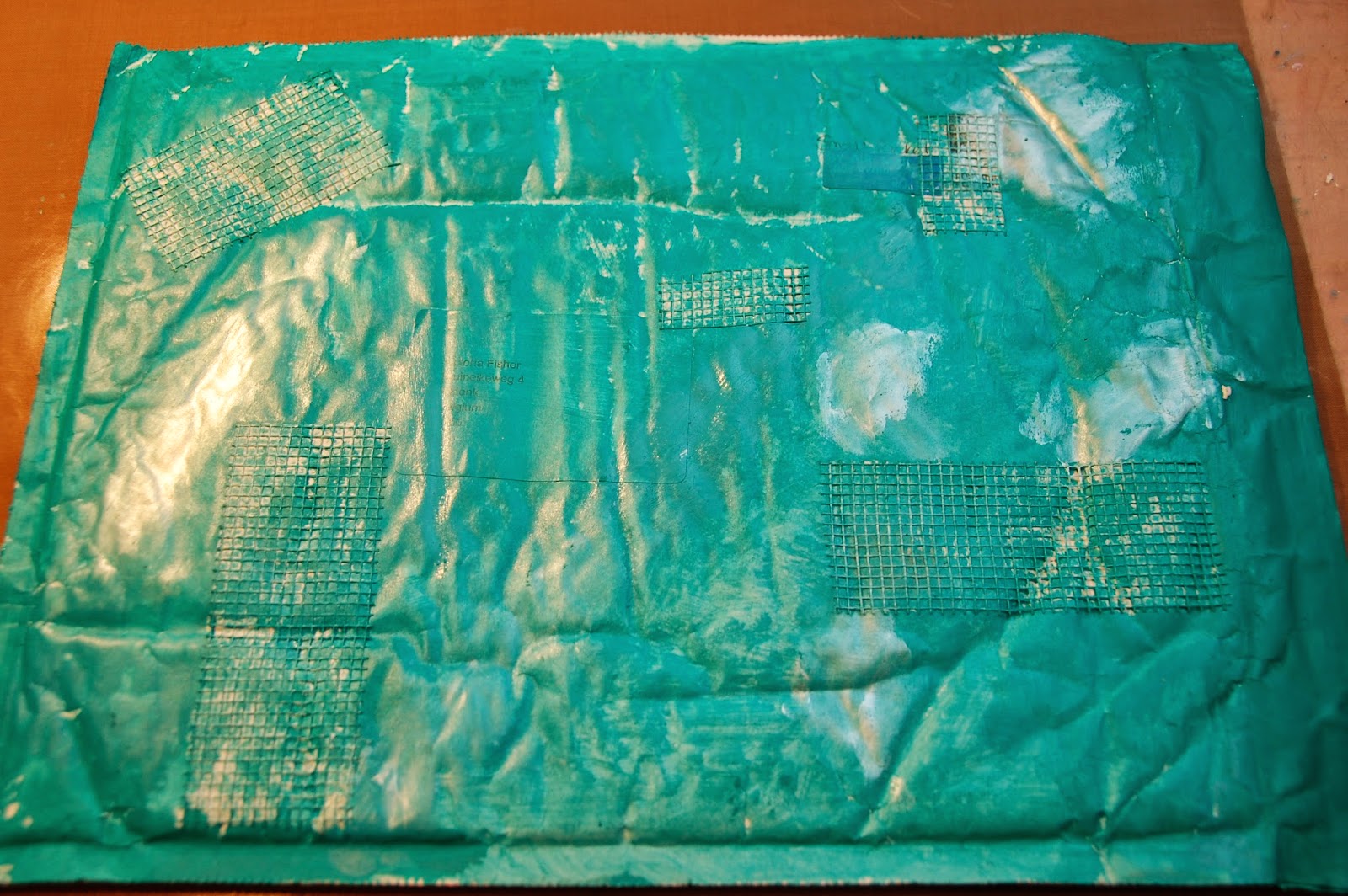
For the first week we are takeling our largest envelop in which all the others will fit.

step 1 was to add some masking tape, I rather felt like adding some dry wall tape


step 2 was to gesso the envelop, as this was already a white envelop I skipped this step.
Step 3 : add 2-tone colour: I used 2 tints of turquoise, however you couldn't see the 2 tones after applying so I added some pearlescent paint to give it some definition.

Step 4 was to add some stamping with archival ink, I used Stazon as I don't own any archival ones. I used stamps I bought earlier that day, I must say I am pleased with the new aquisitions


The following steps were: 
  • add washi tape check
  • add a stencil to highlight the washi tape check
  • add a little more touches of paint check
  • add a picture/drawing... of yourself, I gave this a bit of a twist as I added a butterfly: I love butterflies and I like to be as free, distinguished and elegant as one.
  • Add the name of the workshop: for this I used some scrabble tiles
So without further ado here is my finished envelop


Can't wait to start the next assignement.

Wednesday, July 2, 2014

Shakespeare - junk journal page #20

gessoed cardboard foodpackage + images out of dictionary = 


Gelliprinted over it with a letterstencil in 3 different colors (brown, yellow and orange). You don’t really see the letters but I’m pleased with the background.
Because one of the images was of Shakespeare I took my inspiration from that.
I took a piece of a doiley, sprayed it with red Dylusions and glued it on some double sided carpet tape, added gold glitters in the empty spaces and glued it in the corner of the page.
On the other side I added a lace border with a stamp (from Kaiserkraft I believe) and added a vintage looking lady ( a free printable from Vintage Emphemera Garden -  just sign up for the newsletter).
Made a flower out of bakingpaper which I use when tea dying paper to age them, used another piece of this bakingpaper to add the journaling stamp on which I wrote a quote from Shakespeare:
It is not in the stars to hold our destiny but in ourselves.
I tried to write in what I think is an old fashioned way. I had an oops while glueing this piece with some gel medium as the marker wasn’t waterproof, so as a result of this it smeared, but this only adds to the vintage charm, don’t you think?
In the upper corner I added a heartshape made out of hot glue which was laying on my desk from an experiment using it as a stamp.


junk used:
cereal package
leftover pieces of dictionary pages
bakingpaper
hotglue heartshape

Wednesday, June 25, 2014

Turkey has the key to paradise - junk journal page #19

After watching a Carolyne Dube video on using scraps I was so energized, I just had to grab my scrapbox


And get started.
It was so much fun picking scraps


and gluing them randomly on the page.


I also added some color with oil pastels and some writing (words that came to mind when thinking of our holiday last week)

I wanted to add a stencil or mask and suddenly I knew it had to be a Mosk, so I set myself to making one myself, this wasn’t easy but I am satisfied with the result.


And this is the finished page, just added some more stenciling with an Arabian style stencil (to use up all the blue paint I had still on my palette), an attempt at some Arabian writing and a key and red moon embillishment to top it all of.


junk used:
* scrappaper
* ribbon from a gift package
* outline of a punch-out